OCR Odyssey: Taming Text Recognition for Hebrew Classics
Continuation of this previous post: “General Update, and Discussion of Widely Available Cutting-Edge Software Tools that Read Text in Images (=OCR), including Hebrew” (October 24, 2023)
As discussed in the previous post, the Windows Snipping Tool's new optical character recognition (=OCR) functionality offers impressive and user-friendly text recognition capabilities.
However, there are a few notable challenges, particularly when it comes to deciphering certain Hebrew characters. I’ll discuss these here.
Similar to common mistakes made by people, the OCR sometimes confuses characters like נ with ר, ג with ד, and several others:
ו = ז
ב = כ
כ = ס
ם = ס
י = ו
ו = ן
ט = מ
This is where Avi Shmidman's Rabbinic Hebrew spell-checking tool, introduced at the Digital Humanities workshop in Haifa a few months ago, could prove invaluable, potentially correcting these frequent misreadings. Unfortunately, this tool is not yet available as a simple-to-use tool.
Reference books and indexes frequently feature a two-column format. This formatting introduces an issue where the order of columns is often inverted, with the second column being processed before the first.
The OCR fails to capture other formatting elements such as boldface and font size, necessitating manual reformatting.
(As an aside, older works are known for their dense formatting and often difficult prose style. Modern formatting enhancements, such as line breaks and bolding for cited texts, can significantly aid in comprehension. See my previous piece, for a good example of this: “On an important digital layout of Maimonides’ Sefer HaMitzvot” [August 2, 2023])
Moreover, the old-fashioned way of indicating bold text in Hebrew through spacing, as used to be employed by publishers like Mossad Harav Kook, is not recognized by the OCR. Instead, the spaced text is treated as regular text, requiring manual adjustment to reflect the intended emphasis.
Similarly, the older style of quotation marks that used to be used by Mossad Harav Kook and others (based on the German style), where an opening quote appears at the bottom, instead of at the top,1 is often misinterpreted by the OCR as a comma or a pair of commas.
When it comes to highlighting or citing text by enlarging the font, such formatting nuances are not preserved in the OCR process and must be added back by hand.
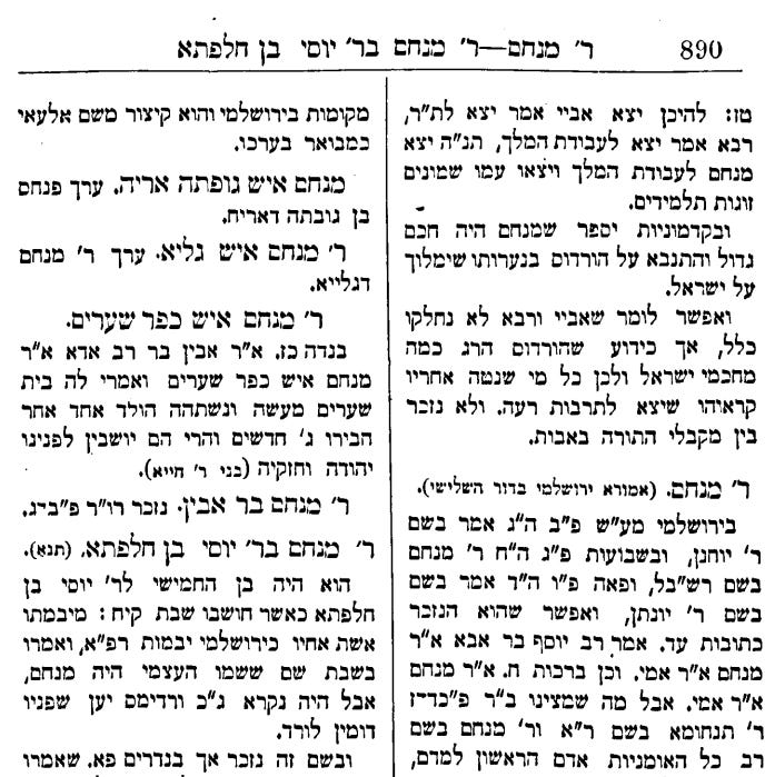
As an illustrative case, consider the transcription of the monumental Toldot Tanaim VeAmoraim, published in London in 1910. (There is an extensive transcription project of this work on Hebrew Wikisource, which is approximately 40% complete.) I tested OCR of page 890 of Toldot Tanaim VeAmoraim, accessed via HebrewBooks.org. The types of formatting issues I mentioned are evident, and require careful manual correction to ensure the digitized text maintains the integrity of the original. (And all this is even before doing things like opening up acronyms, and adding annotations and hyperlinks to sources.)
Original
Screenshot of the top half of page:
My transcription, with improved formatting
Screenshot:
Hebrew Wikisource Transcription
And compare the transcription of a different entry, in the Hebrew Wikisource transcription of Toldot Tanaim VeAmoraim (ר' בנאה - בנייה):
Quotation mark - Wikipedia:“ The German tradition preferred the curved quotation marks, the first one at the level of the commas, the second one at the level of the apostrophes: „…“.


