

Mapping the High-Level Hierarchical Structure of Classical Hebrew Texts: A Case Study of Graphing Talmudic Chapters and Word Counts
Introduction
The corpus of classical Hebrew literature represents one of humanity's most enduring textual traditions, spanning millennia of intellectual history. From the Biblical canon to the sprawling dialectics of the Talmud, these texts have traditionally been approached through close reading and linear study. However, the digital humanities revolution offers us powerful new lenses through which to view these ancient works. Visualization techniques, in particular, allow us to step back and observe macroscopic patterns that might otherwise remain invisible to even the most dedicated scholars.
In this piece, I present recent research on visualizing the structural hierarchies of classical Hebrew works, with a particular focus on the Talmud Bavli (Babylonian Talmud). By quantifying these texts through word counts and representing them visually, we can gain new insights into their relative size, internal organization, and distribution of content. These visualizations serve not merely as aesthetic representations but as analytical tools that prompt new questions and perspectives on these foundational texts.1
Quantitative analysis of classical texts opens new avenues for understanding their composition and evolution. This piece extends that work by exploring various visualization techniques and their application to Talmudic literature.
Outline
Mapping the High-Level Hierarchical Structure of Classical Hebrew Texts: A Case Study of Graphing Talmudic Chapters and Word Counts
Intro
Contextualizing Within Digital Humanities: Sefaria's Visualization Efforts
Examples
Sefaria - ‘visualize/library/Tanakh’
Sefaria - ‘visualize/library/Tanakh/Torah’
Data Collection and Methodology
Source Material and Word Count Analysis
Visualization Design Considerations
Sunburst Visualization of the Complete Talmud
Focused Sunburst: Major Tractates
Treemap Visualization: An Alternative Perspective
Comparative Analysis of Visualization Techniques
Sunburst Charts
Treemaps
Patterns and Insights Revealed
Size Distribution and Canonical Importance
Order and Arrangement
Chapter Proportionality
The "Three Bavot" Phenomenon
Methodological Reflections and Challenges
Data Accuracy and Standardization
Visualization Design Decisions
Technological Implementation
Textual Complexity
Future Directions
Expanded Corpus Visualization
Multi-dimensional Visualizations
Integration with Other Digital Humanities Approaches
Pedagogical Applications
Conclusion: Visualization as Scholarly Methodology
References
Contextualizing Within Digital Humanities: Sefaria's Visualization Efforts
My work on Talmudic visualizations does not exist in isolation but participates in a broader movement within Jewish digital humanities. Sefaria, a nonprofit organization creating a free digital library of Jewish texts, has pioneered several visualization approaches that complement and contrast with my work.
Sefaria's visualization library (accessible at https://www.sefaria.org.il/visualize/library/) takes two major approaches to representing textual relationships:
Library Visualizations: Representing their entire digital library in word counts as sunburst charts.
Intertextual Connections: Mapping relationships between different texts, such as connections between the Talmud and Mishneh Torah.
While my visualizations focus primarily on quantitative metrics (word counts) and hierarchical structure, Sefaria's approach also includes intertextual relationships and citation networks.2
It’s worth noting that Sefaria does have sunburst charts (a subset of pie charts) visualizing word counts, but these are missing labels by default.
Upon clicking, the title of the work appears, and the word count appears on the top right (overall, not especially usable, unfortunately):
https://www.sefaria.org.il/visualize/library/Tanakh

https://www.sefaria.org.il/visualize/library/Tanakh/Torah

The other major category of Sefaria's visualizations is (intertextual) ‘connections’ between works: for example, the ‘connections’ between the Talmud and Mishneh Torah, which reveals patterns of influence and reference across different eras of Jewish legal literature:
https://www.sefaria.org.il/explore-Bavli-and-Mishneh-Torah

This network approach could potentially be combined with my quantitative visualizations to create even richer analytical tools.
And see also:
Jerusalem - ירושלים
https://www.sefaria.org.il/garden/jerusalem
Data Collection and Methodology
Source Material and Word Count Analysis
The foundation of this visualization project is my comprehensive word count analysis of the Babylonian Talmud: "Bavli By the Numbers: Word Counts of All Chapters in Talmud Bavli". The Talmud consists of 38 tractates (masekhtot), each divided into chapters, totaling approximately 1.7 million words in the original Aramaic and Hebrew. To establish accurate word counts, I compiled data from each tractate and chapter, organizing them into a structured dataset.
Visualization Design Considerations
When approaching the visualization of hierarchical textual data, several considerations guided my design choices:
Hierarchical Representation: The visualization needed to clearly represent the nested structure of tractates and their constituent chapters.
Size Proportionality: The visual elements needed to accurately reflect the relative word counts.
Legibility: Labels should be as readable as possible
Interactivity: The ability to explore details on demand enhances understanding of the complex structure.3
Comparative Value: The visualizations should facilitate comparisons between different tractates and chapters.
With these principles in mind, I explored multiple visualization techniques, ultimately focusing on sunburst charts and treemaps as the most effective representations for this hierarchical data.
Sunburst Visualization of the Complete Talmud
The first visualization created was a comprehensive sunburst chart representing all 38 tractates of the Babylonian Talmud and their constituent chapters.

This sunburst visualization reveals several notable patterns:
Size Disparity: The chart immediately highlights the substantial variation in tractate sizes. Shabbat (שבת) emerges as the largest tractate with 110,576 words, representing approximately 6.5% of the entire Talmud.
Distribution Patterns: The visualization reveals clusters of similarly-sized tractates, as well as outliers that are significantly larger or smaller than average.
Internal Structure: The outer ring demonstrates how word count is distributed across chapters within each tractate. Some tractates (like Sanhedrin) have a fairly even distribution, while others (like Shabbat) show more variation between chapters.
Organizational Insights: Traditionally, the Talmud is organized by subject matter rather than size. This visualization invites questions about why certain topics generated more extensive discussion than others.
The complete sunburst chart provides a macroscopic view of the entire Talmudic corpus but can be overwhelming in its complexity. For more focused analysis, I created a filtered visualization of selected major tractates.
Focused Sunburst: Major Tractates
To facilitate deeper analysis, I created a second sunburst chart focusing on nine major tractates that collectively represent approximately 44% of the Talmud's total word count:
Shabbat (שבת)
Brachot (ברכות)
Sanhedrin (סנהדרין)
Chullin (חולין)
Bava Kamma (בבא קמא)
Bava Metzia (בבא מציעא)
Bava Batra (בבא בתרא)
Pesachim (פסחים)
Yevamot (יבמות)

This focused visualization offers several advantages:
Enhanced Readability: With fewer elements, the labels and segments become more legible and distinct.
Comparative Focus: The selected tractates are among the most commonly studied, making comparisons between them particularly valuable for scholars and students.
Color Differentiation: The more limited palette allows for greater color distinction between tractates.
Detailed Exploration: The interactive nature of the visualization allows users to hover over segments to see exact word counts and percentages.
The filtered sunburst chart reveals that Shabbat remains the largest tractate among this selection, followed by Sanhedrin and Chullin. The three Bavot (Bava Kamma, Bava Metzia, and Bava Batra) collectively form a substantial portion of this selection, reflecting their importance in Jewish civil law.
Treemap Visualization: An Alternative Perspective
While the sunburst chart effectively displays hierarchical relationships, I also explored alternative visualization techniques. The treemap visualization offers a different perspective on the same data, using nested rectangles rather than concentric arcs.

The treemap visualization offers several distinct advantages:
Space Efficiency: Treemaps use space more efficiently than sunburst charts, particularly for displaying text labels within smaller segments.
Size Comparison: The rectangular format makes it easier to visually compare the relative sizes of different elements.
Grid Structure: The grid-like layout creates a more structured representation that some viewers find easier to parse.
Chapter Visibility: Individual chapters are more distinctly visible as separate entities, allowing for easier comparison between chapters.
The treemap confirms the patterns observed in the sunburst charts while providing additional clarity on the internal structure of each tractate. For example, it becomes immediately apparent that certain tractates have one or two chapters that are substantially larger than their other chapters.
Comparative Analysis of Visualization Techniques
Both the sunburst chart and treemap visualization offer valuable but distinct perspectives on the same underlying data. Their comparative strengths and weaknesses merit consideration:
Sunburst Charts
Strengths:
Clearly represent hierarchical relationships through concentric rings
Maintain a sense of the whole and its parts simultaneously
Effectively display radial proportions
Intuitively show the parent-child relationships
Limitations:
Can become crowded with many segments
Outer ring segments may become too narrow for labels
Comparing segments across different branches can be difficult
Treemaps
Strengths:
Maximize use of space
Facilitate easier comparison of relative sizes
Allow for more readable labels in smaller segments
Present a more structured, grid-like representation
Limitations:
Hierarchical relationships may be less immediately apparent
Deep hierarchies can be challenging to represent clearly
Aspect ratios can sometimes distort visual comparison
The choice between these visualization techniques ultimately depends on the specific analytical goals. Sunburst charts excel at showing hierarchical structure and providing a holistic view, while treemaps are superior for comparing sizes and displaying detailed labels in space-constrained visualizations.
Patterns and Insights Revealed
The visualizations generated in this research reveal several noteworthy patterns that merit scholarly attention:
1. Size Distribution and Canonical Importance
The substantial variation in tractate sizes raises questions about the relationship between textual volume and canonical importance. While Shabbat's position as the largest tractate aligns with its central religious significance, other patterns are less intuitive. For instance, the tractate Yevamot is one of the largest despite being mostly inapplicable.
2. Order and Arrangement
The traditional ordering of Talmudic tractates follows thematic principles rather than size considerations. Visualizing them by word count creates an alternative organizational schema that might reveal patterns in the historical development and editorial processes of the Talmud.
3. Chapter Proportionality
Within tractates, chapter sizes often vary considerably. In some cases, a single chapter might constitute over 30% of the entire tractate's word count. This pattern is particularly evident in tractates like Kiddushin, where the first chapter "Ha'isha Niknet" (האשה נקנית) is substantially larger than subsequent chapters; the same is true for Perek Chelek in Sanhedrin. These disproportionate chapters often contain foundational discussions unrelated to the rest of the tractate.4
4. The "Three Bavot" Phenomenon
The three "Bava" tractates (Bava Kamma, Bava Metzia, and Bava Batra) collectively form one of the largest textual units in the Talmud, focusing on civil law. Visualizing them together highlights their substantial combined volume (approximately 245,000 words, or 14.4% of the entire Talmud). This substantial allocation of text to civil matters reflects the Talmud's concern with this topic.
Methodological Reflections and Challenges
The process of creating these visualizations presented several methodological challenges that warrant discussion:
1. Data Accuracy and Standardization
Obtaining consistent word counts required addressing variations in textual editions, punctuation conventions, and the handling of technical terms that might appear differently across sources. The standardization process required careful attention to maintain consistency throughout the dataset.
2. Visualization Design Decisions
Each visualization technique required specific design decisions that inevitably emphasized certain aspects of the data while potentially obscuring others. For instance, the color scheme choices in both the sunburst chart and treemap influence how viewers perceive relationships between elements. These decisions were made with attention to both aesthetic considerations and analytical clarity.
3. Technological Implementation
Implementing interactive visualizations required balancing functionality with accessibility. The visualizations were created using D3.js within a React framework,5 allowing for responsive interactivity while maintaining compatibility across platforms.
4. Textual Complexity
The Talmud's complex, non-linear structure presents unique challenges for visualization. Unlike purely hierarchical texts, the Talmud contains dialogic elements, nested commentaries, and intertextual references that are difficult to capture in dimensional visualizations. The current approach focuses on quantitative measurement rather than qualitative textual features.
Future Directions
This research opens several promising avenues for future exploration:
1. Expanded Corpus Visualization
The techniques developed for visualizing the Talmud could (and I hope to) be extended to other major classical Hebrew works, especially:
Bible
Mishnah
Mishneh Torah
Zohar
Tur/Shulchan Aruch
Visualizing these texts using consistent methodologies would facilitate comparative analysis across different eras and genres of Jewish literature.
2. Multi-dimensional Visualizations
Future visualizations could incorporate additional dimensions beyond word count, such as:
Chronological distribution of content
Linguistic features (Hebrew vs. Aramaic proportions)
Subject matter categorization
Citation frequency in later literature6
Multi-dimensional visualizations could potentially reveal correlations between these various factors.
3. Integration with Other Digital Humanities Approaches
Combining quantitative visualizations with other digital humanities methodologies could yield richer insights:
Text mining and topic modeling to reveal thematic patterns
Network analysis of citation patterns
Computational stylometry to examine authorship questions
Mapping of people, places, and works mentioned in the text7
4. Pedagogical Applications
These visualizations have significant potential as pedagogical tools for Talmud study:
Helping students, readers, and scholars understand the overall structure of the corpus
Providing visual context for particular passages
Creating interactive study aids that link visualizations to text
Developing curriculum materials that incorporate visual learning
Conclusion: Visualization as Scholarly Methodology
The visualizations presented in this piece demonstrate how quantitative analysis and visual representation can complement traditional textual scholarship. By rendering abstract structural relationships in concrete visual form, these representations make the macroscopic organization of classical texts accessible to both scholars and students.
The Talmud, with its complex structure and dialectical nature, particularly benefits from visualization approaches that can reveal patterns not readily apparent through linear reading. The substantial variations in tractate and chapter sizes, clearly demonstrated in both the sunburst and treemap visualizations, invite further investigation into the historical, religious, and intellectual factors that shaped the development of this foundational text.
As digital humanities methodologies continue to evolve, visualization techniques will increasingly serve not merely as illustrations of existing knowledge but as analytical tools that generate new insights and research questions. The work presented here represents an early exploration of these possibilities within the specific context of classical Hebrew literature.
For scholars, students, and general readers of these texts, these visualizations offer a new way to conceptualize and navigate complex textual traditions. They provide a macroscopic complement to the microscopic focus of traditional close reading, allowing us to see both the forest and the trees of our textual heritage.
References
"Bavli By the Numbers: Word Counts of All Chapters in Talmud Bavli"
Sefaria Visualization Library. https://www.sefaria.org.il/visualize/library/
"Visualizing Links in Mishneh Torah, Shulchan Arukh and More." Sefaria, https://www.sefaria.org.il/sheets/299491
See also this general scholarship:
Sinclair, Stéfan, and Geoffrey Rockwell. "Text Analysis and Visualization" In A New Companion to Digital Humanities, edited by Susan Schreibman, Ray Siemens, and John Unsworth. Wiley-Blackwell, 2016.
Lima, Manuel. The Book of Trees: Visualizing Branches of Knowledge. Princeton Architectural Press, 2014.
Jänicke, Stefan, et al. "On Close and Distant Reading in Digital Humanities: A Survey and Future Challenges." Eurographics Conference on Visualization, 2015.
Drucker, Johanna. Graphesis: Visual Forms of Knowledge Production. Harvard University Press, 2014.
Manovich, Lev. "What is Visualization?" Visual Studies 26, no. 1 (2011): 36-49.
Sinclair, Stéfan, et al. "Information Visualization for Humanities Scholars." In Literary Studies in the Digital Age, edited by Kenneth M. Price and Ray Siemens. Modern Language Association of America, 2013.
See my recent synthesis of my research on word counts of classic Hebrew works: “Quantifying the Jewish Canon: Computational Analyses of Classical Hebrew Texts”.
And see my discussion on the topic in my discussions of ChavrutAI, especially in “Designing ChavrutAI: Building a Customized Talmud Interface for the Digital Age”, section “Navigation Architecture”.
And also compare my visualizations (bar charts and heatmaps) in “A Computational Approach to Identifying and Mapping Aggadic Content in the Talmud: Word Count as a Robust Proxy Indicator”.
Unfortunately, in practice, I have not found Sefaria’s ‘intertextual relationships and citation networks’ visualizations to be particularly enlightening; likely due to the particular way they’re implemented.
Overall, Sefaria's visualizations come across as old (meaning, my impression is that they were created many years ago), poorly maintained, and buggy. Even worse, the word counts seem to be wildly off.
This ‘interactivity’ was present in the original ‘Claude AI’ artifacts that I provide screenshots of below; however, I was not successful in ‘publishing’ them for public access (due to a bug/error in the Claude implementation).
See my recent piece on the first chapter of Kiddushin. And see my note there, that these are the two largest chapters in the Babylonian Talmud (out of the 300+ chapters).
Via ‘Claude’ AI chatbot.
Citation frequency is what Sefaria refers to as “connections” (חיבורים), i.e. ‘intertextuality’, see earlier in this piece.
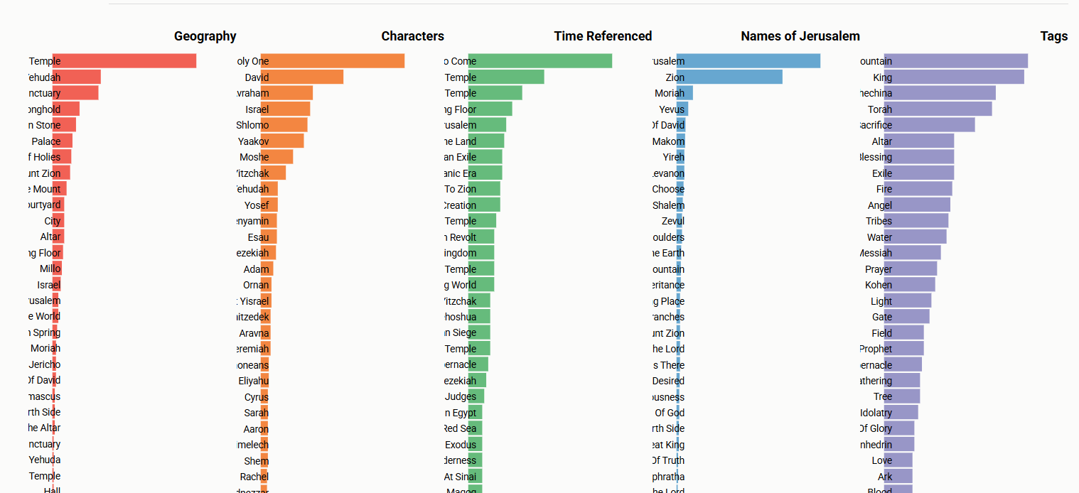
Compare my recent piece on Talmud NER: “Mapping the Talmud: Scalable Natural Language Processing (NLP) for Named Entities, Topics, and Tags in the Talmudic Corpus“.
And see the Sefaria visualization cited and screenshotted earlier in this piece, for ‘Jerusalem’.